
How to create and use product cards for your catalogs and Showroom.
Product Cards are reusable design templates that control how products display in catalogs and Showroom. Design formatting once (fonts, colors, layout), apply to all products automatically.
Key concept: Product fields store your data. Product Cards control presentation. To format 100+ products consistently, edit ONE card—not each product individually.
Benefits of Product Cards
-
Consistency: Uniform look across catalogs and Showroom. Card edits update everywhere instantly.
-
Efficiency: Format once, apply to hundreds of products via AutoGrid or manual placement.
-
Flexibility: Different cards for different contexts (catalog vs. showroom vs. price list).
-
Automatic Updates: Product data changes reflect immediately across all card uses.
How to Create a Product Card
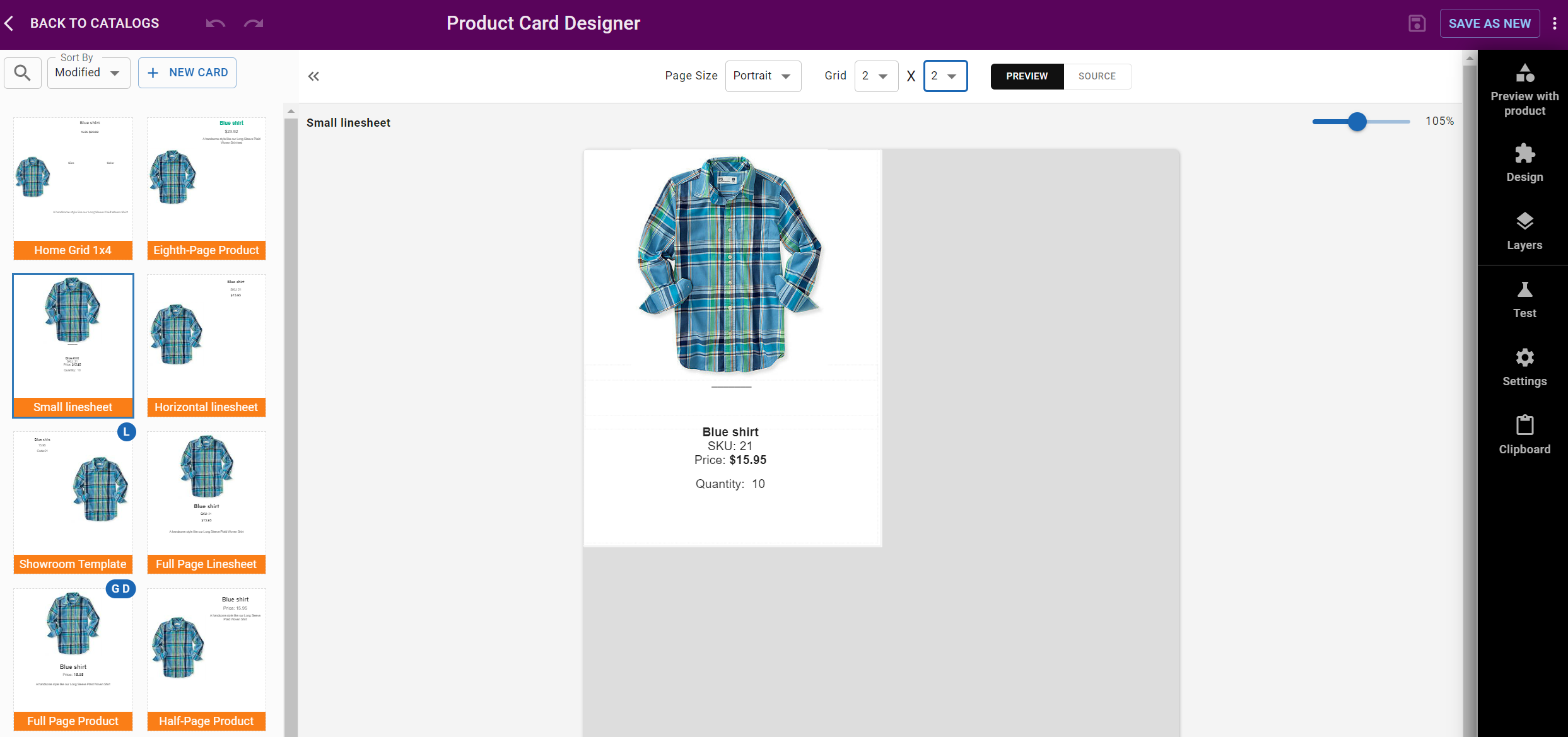
Step 1: Access the Card Designer
Go to Design → Cards or design in-place from the Catalog Designer, Auto Grid, etc.
Step 2: Start Your Card
Choose to modify or copy a pre-designed card, or create a new one from scratch.
Step 3: Add Elements
Add elements to your card from the Design tab in the sidebar:
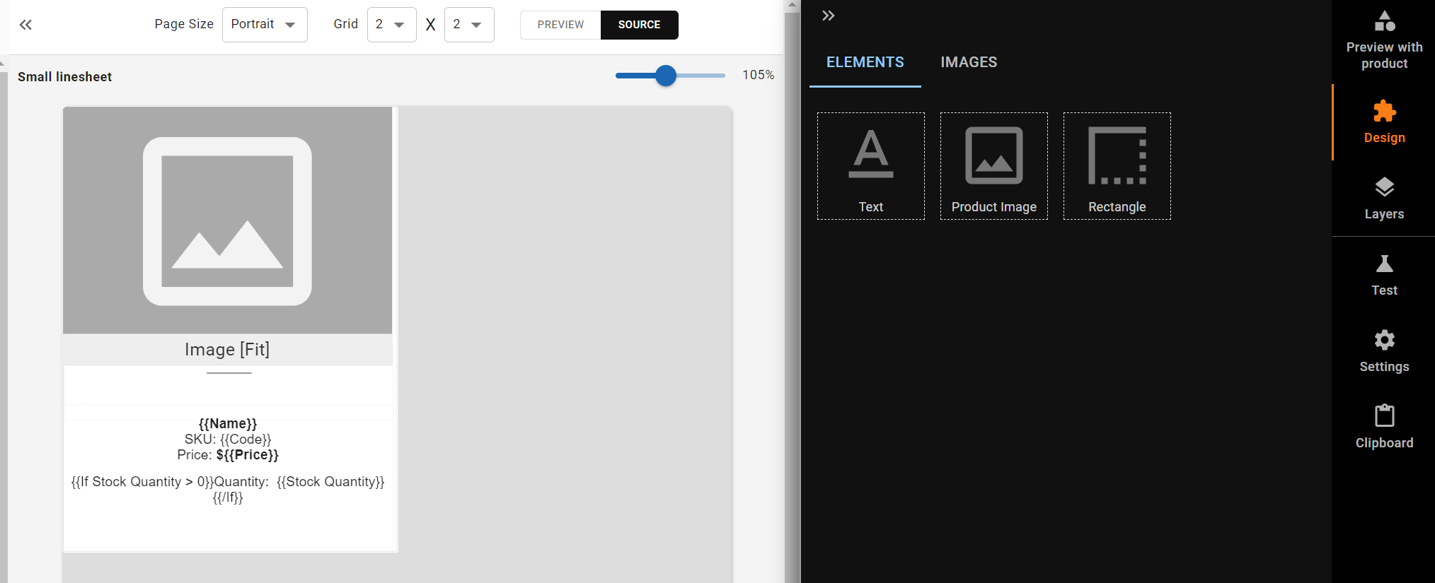
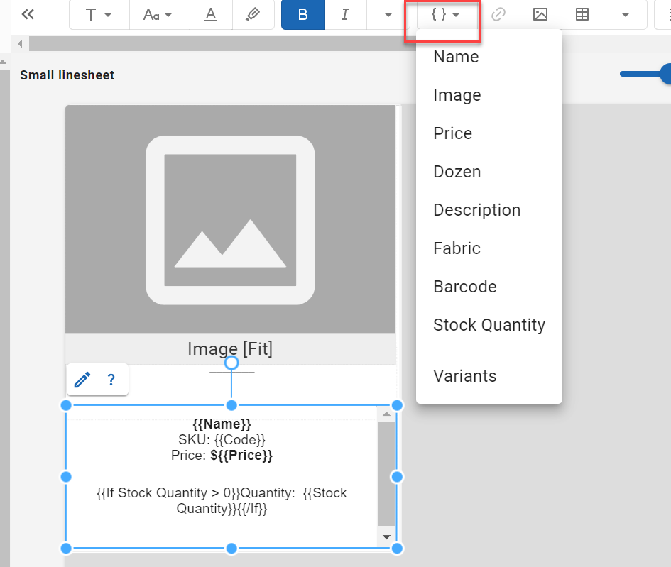
- Text: Add content with product field placeholders (e.g.,
{{Name}},{{Price}},{{Code}}). Built-in fields (Name,Code,Category,Rank,Image) are always available. Custom fields (Price,Description, etc.) are defined in your product category.
-
Product Image: Add product image placeholders that display each product's image
-
Rectangle: Use Rectangle element for backgrounds and visual containers
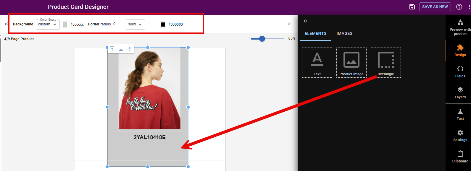
Step 4: Customize Your Design
- Move, resize, adjust layers and elements
- Format text with different fonts, colors, and styles
- Adjust image sizes and positions
- Set background colors or images
Step 5: Save Your Card
Save your Product Card with a descriptive name.
Step 6: Preview Your Card
Preview your card with different products to ensure it looks good with various settings, content, and different categories.
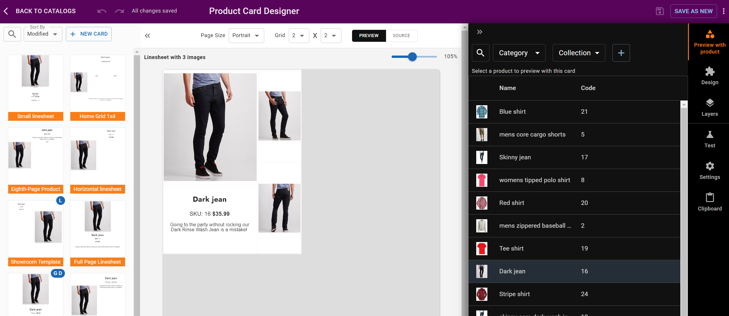
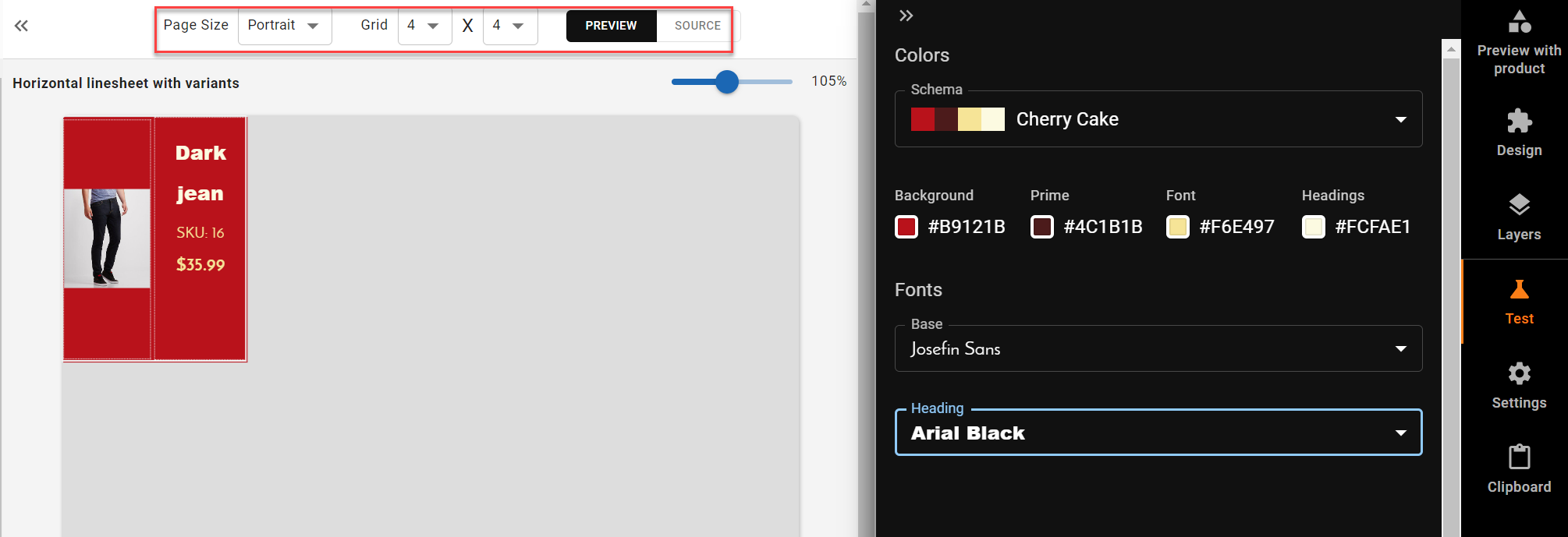
Use the Products tab in the sidebar to select different products for preview. Use the Test tab to preview with different catalog themes.
Settings
Cards have several settings accessible from the Settings tab:
- Card Name: Give your card a descriptive name
- Default Page Size: Cards can have different grid sizes (from 1/12 to full page width/height). These sizes are used in Showroom, overlays, and catalog pages.
- Default Card for:
- Catalog Product Grid: Use this card as the default when building product grids in the Catalog Designer
- Showroom Product Details: Use this card for product detail views in Showroom
- Showroom Product List: Use this card for product list views in Showroom
Cards also inherit catalog theme settings (fonts, colors). You can test with different themes using the Test tab.
Using Product Cards in Catalogs
Open your catalog in the Catalog Designer.
For a Single Product
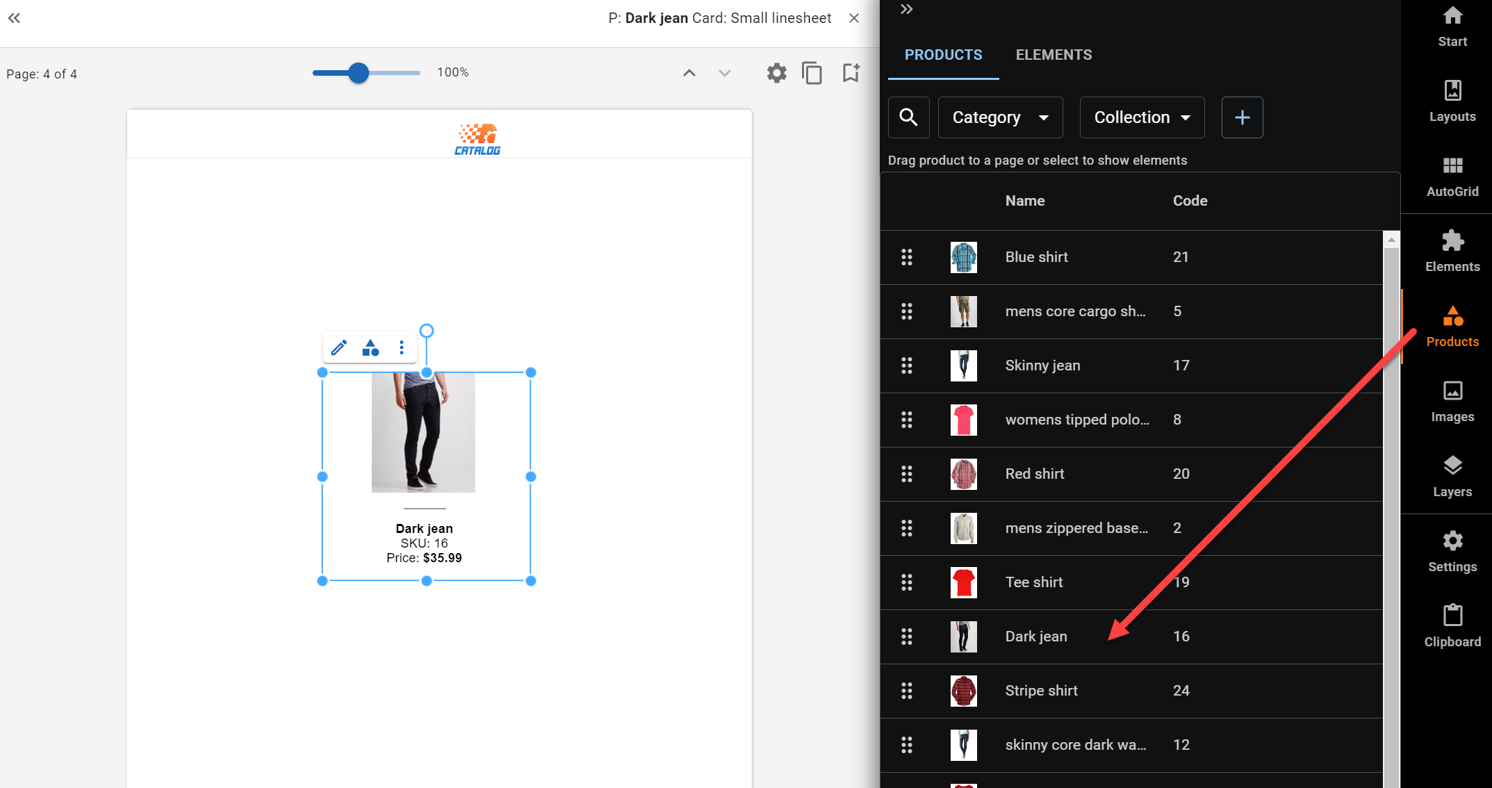
- Click a product in the sidebar to open its elements
- Drag your Product Card onto the page in your catalog
For Multiple Products
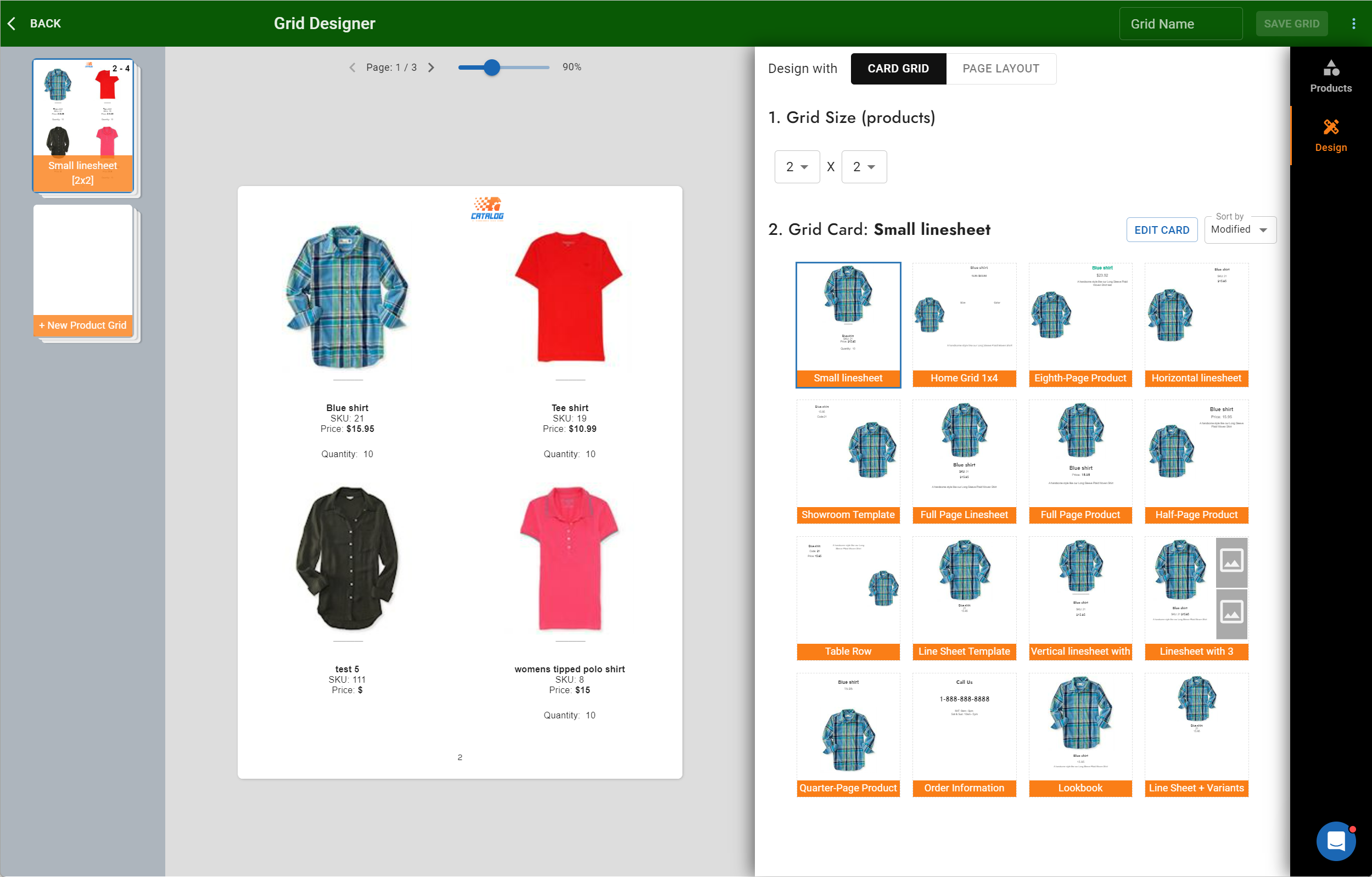
- Use Auto Grids to apply your Product Card to entire sections or the whole catalog
- Select your desired Product Card in the Auto Grid design
Updating Cards in Catalogs
When you update a Product Card design, the changes are reflected immediately in every catalog and page using that card. There is no per-page override: a card looks the same everywhere it is used.
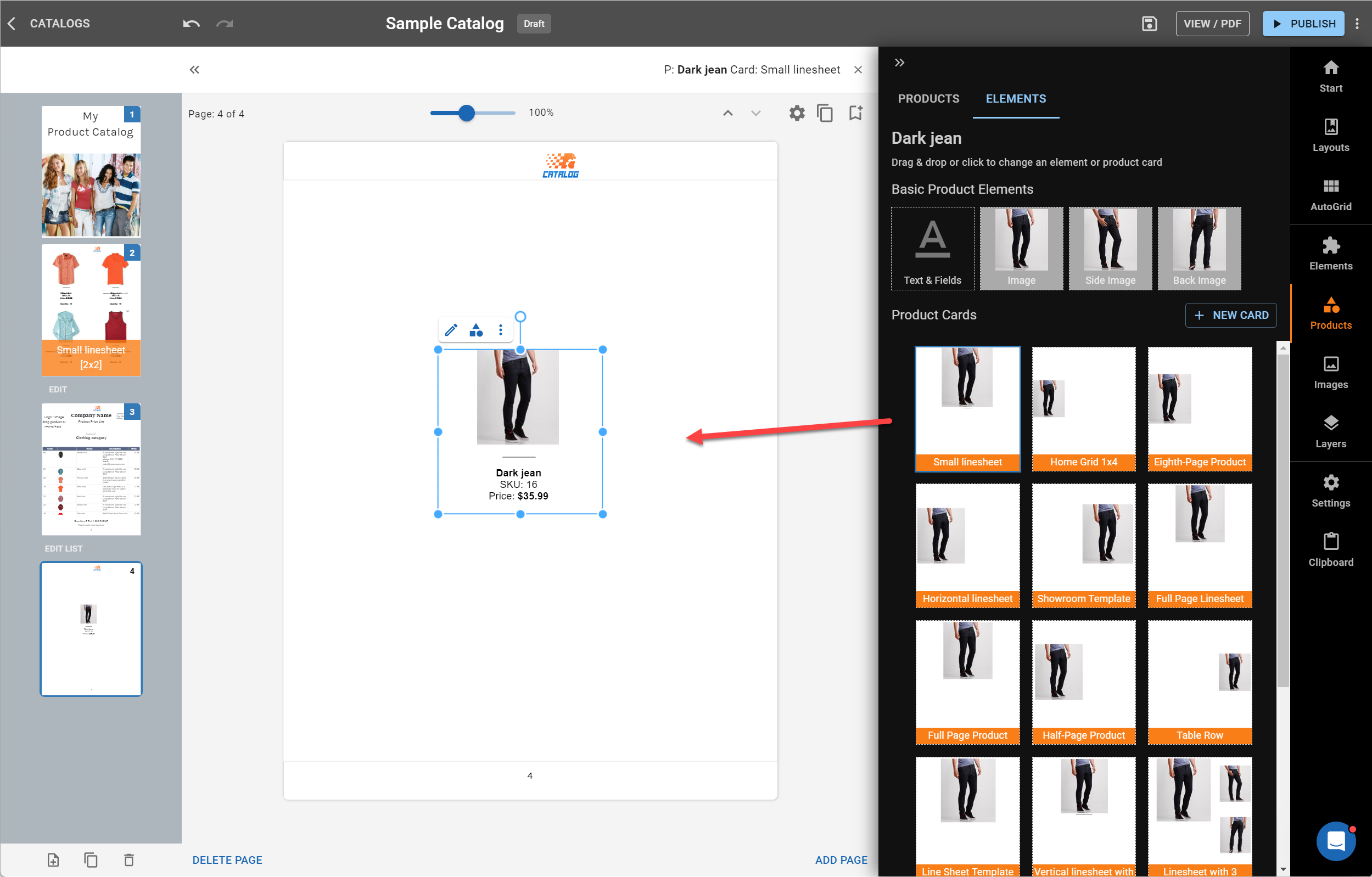
Once done, preview your catalog to ensure everything looks perfect. Share your catalog as an interactive online site or download as a high-quality PDF.
By mastering Product Cards, you'll be able to create professional, cohesive catalogs in no time.